
Creating a Responsive Font Size with clamp() and vw in CSS
Introduction
When designing responsive websites, ensuring that text scales smoothly across different screen sizes improves readability and aesthetics. A great way to achieve this is using the clamp() function in CSS, combined with vw (viewport width). This tutorial will guide you through creating a responsive font size that adheres to specific constraints.
Our Goal
We want the font size to:
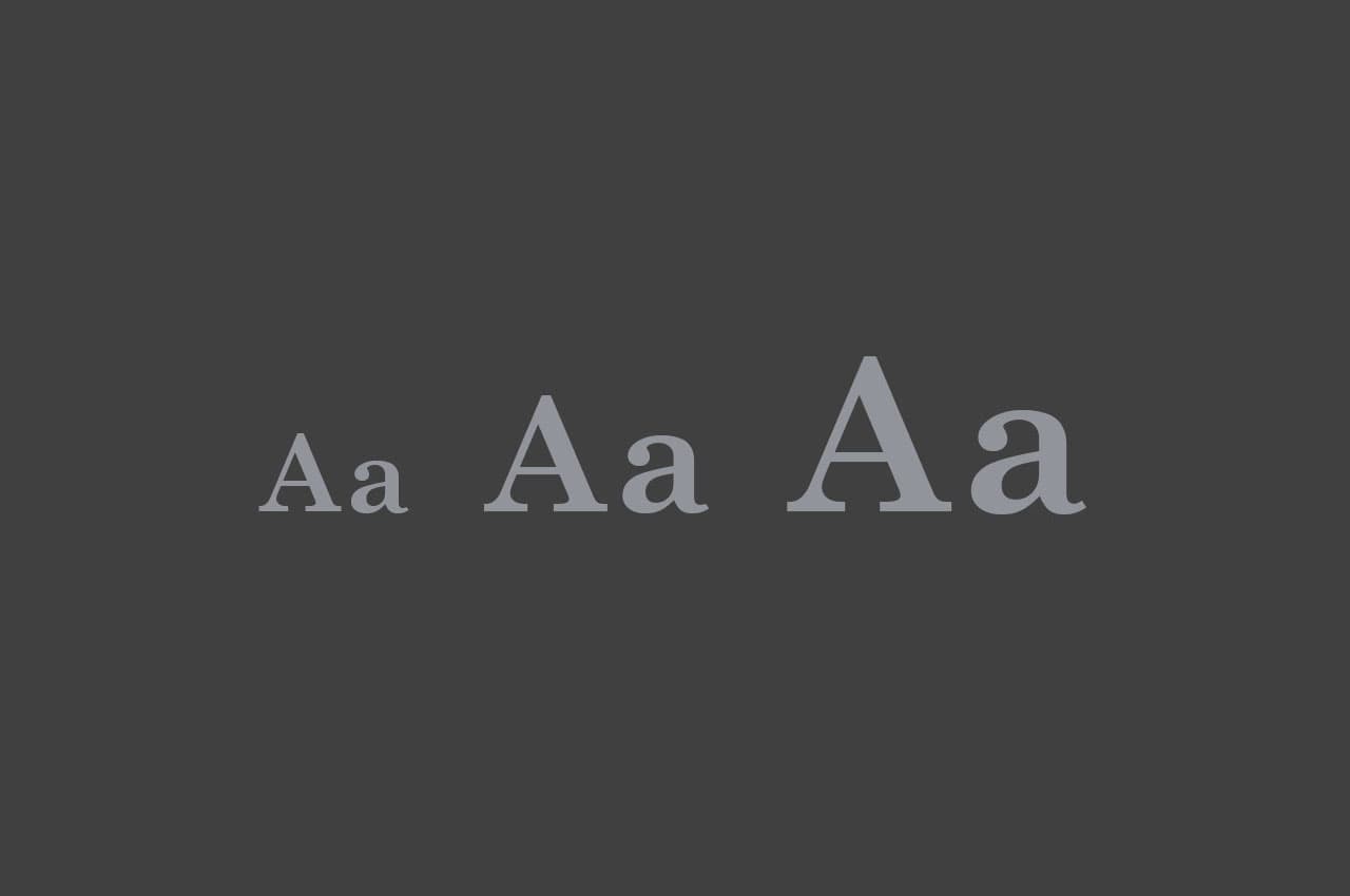
- Be fixed at 16px when the viewport width is less than 640px.
- Be fixed at 36px when the viewport width is 1200px or more.
- Smoothly scale between 640px and 1200px using
vw.
Understanding clamp() in CSS
The clamp(min, preferred, max) function in CSS allows us to set a dynamic value with constraints:
min: The minimum value the property can have.preferred: The preferred (scaling) value.max: The maximum value the property can have.
Using clamp(), we can define a font size that smoothly scales but never exceeds given limits.
The Perfect Formula
To ensure the font size smoothly increases from 16px (at 640px) to 36px (at 1200px), we use the following calculation:
html {
  font-size: clamp(16px, calc((36 - 16) / (1200 - 640) * (100vw - 640px) + 16px), 36px);
}
Breaking Down the Formula
Let's analyze the formula inside clamp():
calc((36 - 16) / (1200 - 640) * (100vw - 640px) + 16px)
This formula ensures that the font size grows proportionally between 640px and 1200px. Here's how it works:
-
(36 - 16) / (1200 - 640): This calculates the growth rate of the font size per pixel increase in viewport width.36px(max size) minus16px(min size) gives20pxtotal growth.1200px(max width) minus640px(min width) gives560pxof scaling range.20 / 560results in 0.035px growth per 1px of viewport width.
-
100vw - 640px: This gives us the current viewport width offset relative to640px.- If the viewport is
800pxwide,100vw - 640px = 160px.
- If the viewport is
-
0.035 * (100vw - 640px): This applies the growth rate to the viewport width offset.- At
800pxwide:0.035 * 160px = 5.6px
- At
-
+ 16px: This ensures the font size starts at 16px at640px.- At
800px:16px + 5.6px = 21.6px
- At
Ensuring the Constraints
clamp(16px, ..., 36px): Ensures that the font size never goes below 16px or above 36px.100vw - 640px: Ensures that scaling only starts from 640px and is relative to that breakpoint.
Implementing in CSS
Here’s the full CSS implementation with media queries for better control:
html {
  font-size: 16px;
}

@media (min-width: 640px) {
  html {
    font-size: clamp(16px, calc((36 - 16) / (1200 - 640) * (100vw - 640px) + 16px), 36px);
  }
}
Testing the Font Size
To test if the font size works correctly:
- Open your browser and resize the window.
- Use the developer tools (F12 or Ctrl+Shift+I in Chrome).
- Check the computed
font-sizein the Elements tab.
Summary
✅ Below 640px, font size stays 16px.
✅ Between 640px and 1200px, it smoothly increases.
✅ At 1200px or more, font size is fixed at 36px.
This approach ensures smooth and controlled scaling of text while keeping it readable on all screen sizes.